Worship slides are one of the most visible parts of a church service, and they do more than just display lyrics or scripture—they set the tone, guide the congregation, and help people engage fully with worship and God’s Word. But even with the best intentions, there are many common mistakes churches make with worship slides that distract, confuse, or slow down a service.
The good news? These mistakes are easy to fix once you know what to watch for. Here are the most common errors and practical tips for keeping your slides clear, engaging, and effective.
1. Choosing Fonts That Are Hard to Read
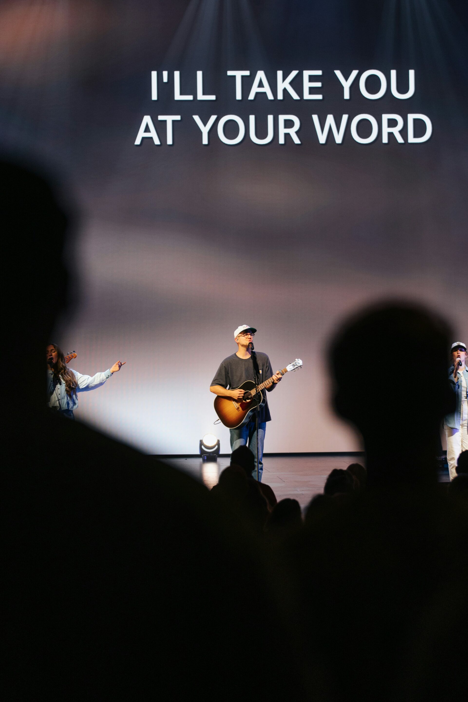
Decorative fonts may look nice, but if your congregation can’t read them from the back of the room, they’re doing more harm than good. Trends in professional worship slides favor bold, clean, white text—sometimes all caps—for maximum clarity. MediaShout allows you to set consistent font styles, so volunteers don’t have to adjust each slide manually. In the picture, you see an extremely simple example of text that is done right.
2. Overcrowding Slides with Text
It can be tempting to include a full verse or long Scripture passage on one slide. But too much text slows down the service and makes it hard for people to follow and find their place when looking up to the screen.
Fix it: Break lyrics or Scripture into 1–4 lines per slide. MediaShout’s Lyrics and Scripture windows allow control of this, with even further editing available on its slide editor. You can fully customize the sizes of text boxes to automatically paginate text split across multiple pages and this is able to be saved onto your template. You can also easily insert your own custom page breaks, whether you’re working with automatically inserted scripture slides, or lyrics, or text you’ve entered onto a “text cue.”
3. Distracting Backgrounds
Motion backgrounds are great but if they are too busy, or even if you’re using busy images with lots of contrasting patterns, it can make slides hard to read and distract from worship.
Fix it: Keep backgrounds simple and complementary. Media packs sourced from professional providers like those included monthly with MediaShout Plus, or the unlimited selection on the Shift Worship Media Plan, provide high-quality, clean visuals that enhance your slides without stealing attention.

4. Poor Contrast Between Text and Background
Low-contrast slides are one of the quickest ways to frustrate your congregation. This means if you’re using white text over a very light background, or worse: black text over a dark background. (In general it’s always best to go with white text).
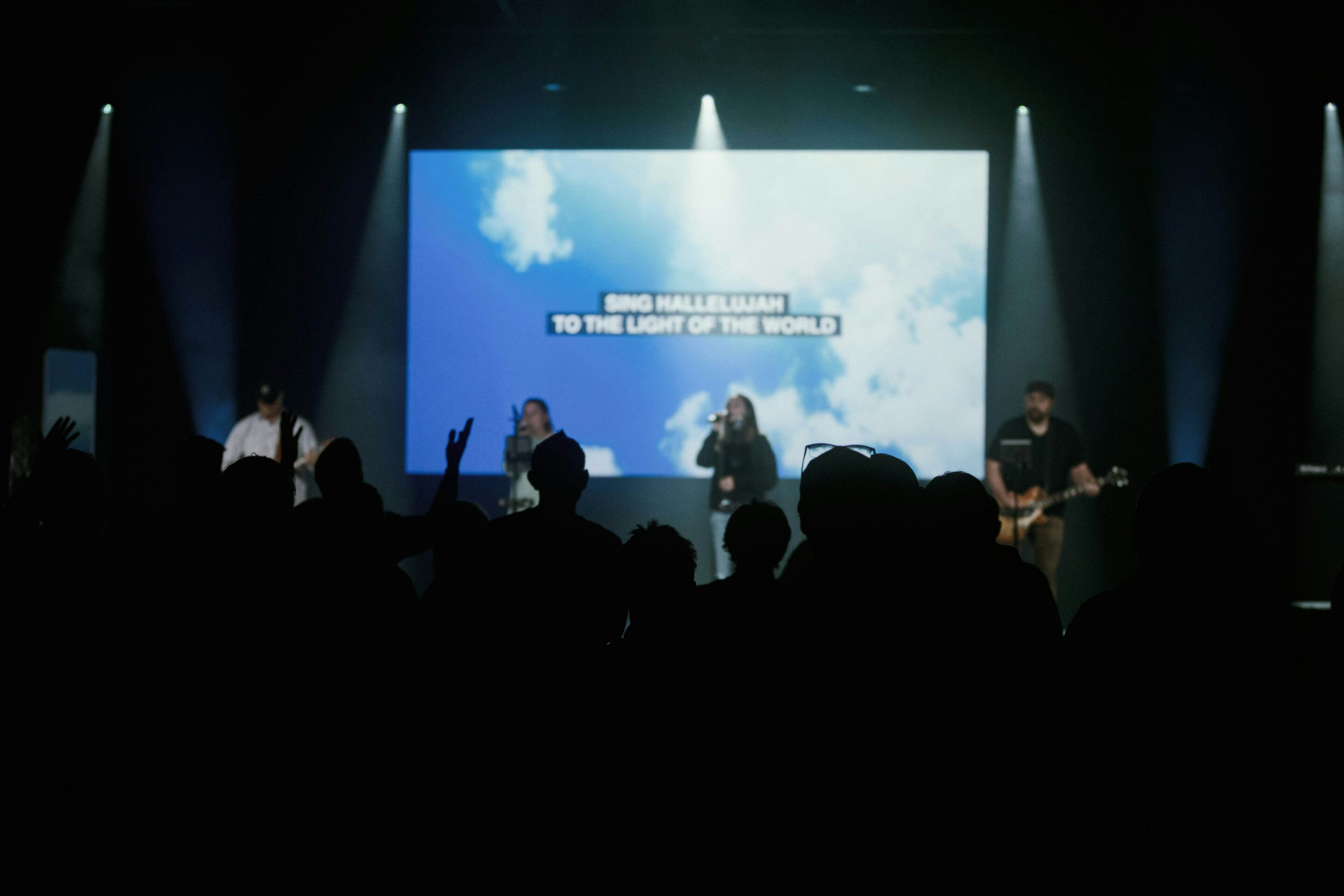
Fix it: Use light-colored text on dark backgrounds for clear visibility. Test your slides on actual projectors or TVs before service, since brightness and color may look different on screens than on a laptop. There are even creative ways to add contrast if you’d like to use a light background, as shown on the image below. It’s easy to add a drop shadow, text outline (be careful as this can look dated), or a text box background like this one using the features of MediaShout.
5. Unnecessary Labels and Punctuation
Leaving in labels like “Verse 1” or “Chorus,” or excessive punctuation, clutters slides and doesn’t help the congregation. Sometimes this happens when copy and pasting lyrics (which you don’t have to do with MediaShout because of CCLI SongSelect integration). It can even be this way when loaded from services like SongSelect, but MediaShout’s tools makes it easy to spot check and remove any excess labels or punctuation, then save the song to your library so it’s ready without any changes the next time you load it.
Fix it: Duplicate slides for repeated lines instead of labeling them, and keep punctuation minimal. Periods are usually not necessary, and commas only sometimes when needing to indicate a natural pause in a line of lyrics for example. Usually a line break should be used instead. Your slides will look cleaner and be easier to follow.
6. Timing Issues
Slides that appear too late or too early can make singing or reading difficult.
Fix it: Train volunteers to advance slides just before the line begins. MediaShout’s ability to navigate slides in any order helps create a smooth flow so operators can focus on timing instead of scrambling through slides to find the right one or just advancing through in a pre-set order, hoping that it will match what the worship team is about to go to.

7. Not Preparing for Spontaneous Worship Moments
Worship leaders may repeat lines or change the order of songs on the fly. You don’t want to be stuck without the ability to follow along if you’re using a software like Powerpoint, or a more complex, difficult to navigate software.
Fix it: Even MediaShout’s regular editing program view allows volunteers to display lyrics and scripture instantly, even while editing. And the Presenter View is even better, giving thumbnails of all available slides for quick launching and advancing (in any order). This ensures your team can respond to live changes without stress.
8. Skipping a Run-Through in the Room
Slides may look perfect on your laptop but be difficult to read in the auditorium.
Fix it: Preview presentations on actual screens and from different seating positions. Go to the back row and observe what the text looks like and how readable it is. MediaShout makes testing quick and easy without losing edits.

Final Thoughts
Worship slides are a ministry tool, not just a technical detail. Keeping text readable, backgrounds simple, and timing precise helps the congregation engage fully and keeps worship flowing smoothly. With tools like MediaShout, even volunteers new to tech can produce professional, clear, and distraction-free slides every week.