When people walk into your church and experience worship, they’re not only listening to words and singing songs—they’re also processing a steady flow of visual information. Whether it’s sermon slides, worship lyrics, background images, or videos, these elements of visual media in worship play a powerful role in shaping how people engage with the message and songs.
Good design doesn’t distract—it directs. It sets the tone, communicates meaning, and helps people focus on God’s Word. Understanding the psychology behind visual media can help your church create presentations that truly support worship instead of pulling attention away from it.
1. Color Sets the Emotional Tone
Colors have a strong psychological impact:
-
Warm colors (reds, oranges, yellows) convey passion, energy, or urgency.
-
Cool colors (blues, greens, purples) communicate calm, reflection, and reverence.
-
Neutral tones help keep focus on the content rather than the background.
When designing worship slides or sermon graphics, ask: What emotional atmosphere does this service or message call for? Choosing the right color palette can create the right emotional posture for worship.
2. Fonts Communicate Personality
Typography isn’t just about readability—it carries personality and tone. A heavy, bold font may communicate strength or authority, while a handwritten script feels personal and intimate.
In worship slides, prioritize readability (large, clear fonts) but also consider tone:
-
Use sans-serif fonts for modern, clean worship lyrics.
-
Use serif fonts sparingly for themes like tradition, heritage, or Scripture emphasis.
-
Avoid overly decorative fonts that are difficult to read at a distance.
Remember: if people can’t quickly read the lyrics or Scripture, they’ll disengage from worship.
3. Layout Directs Attention
The way text and visuals are arranged determines what people notice first. A cluttered slide confuses the brain, but a clean layout directs attention exactly where you want it.
Tips for effective layout:
-
Use hierarchy (larger text for main points, smaller for supporting info).
-
Leave white space so the design feels open, not overwhelming.
-
Keep slides consistent so viewers spend time absorbing the message—not adjusting to new layouts.

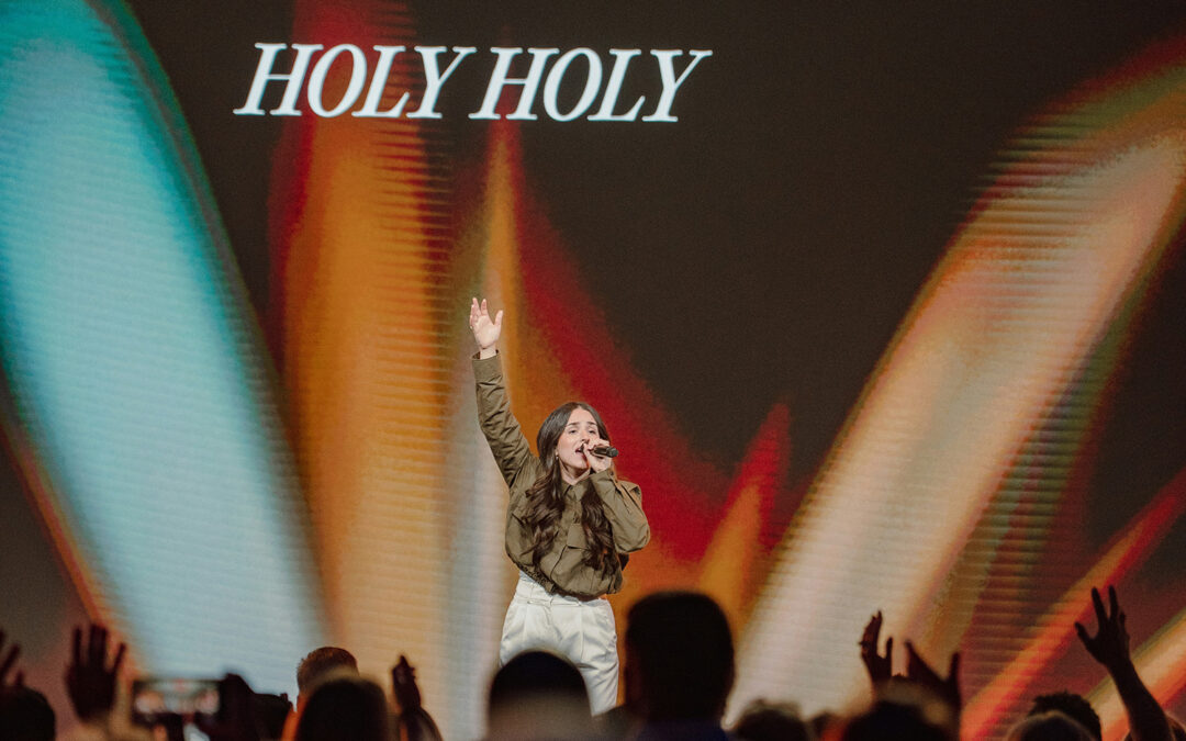
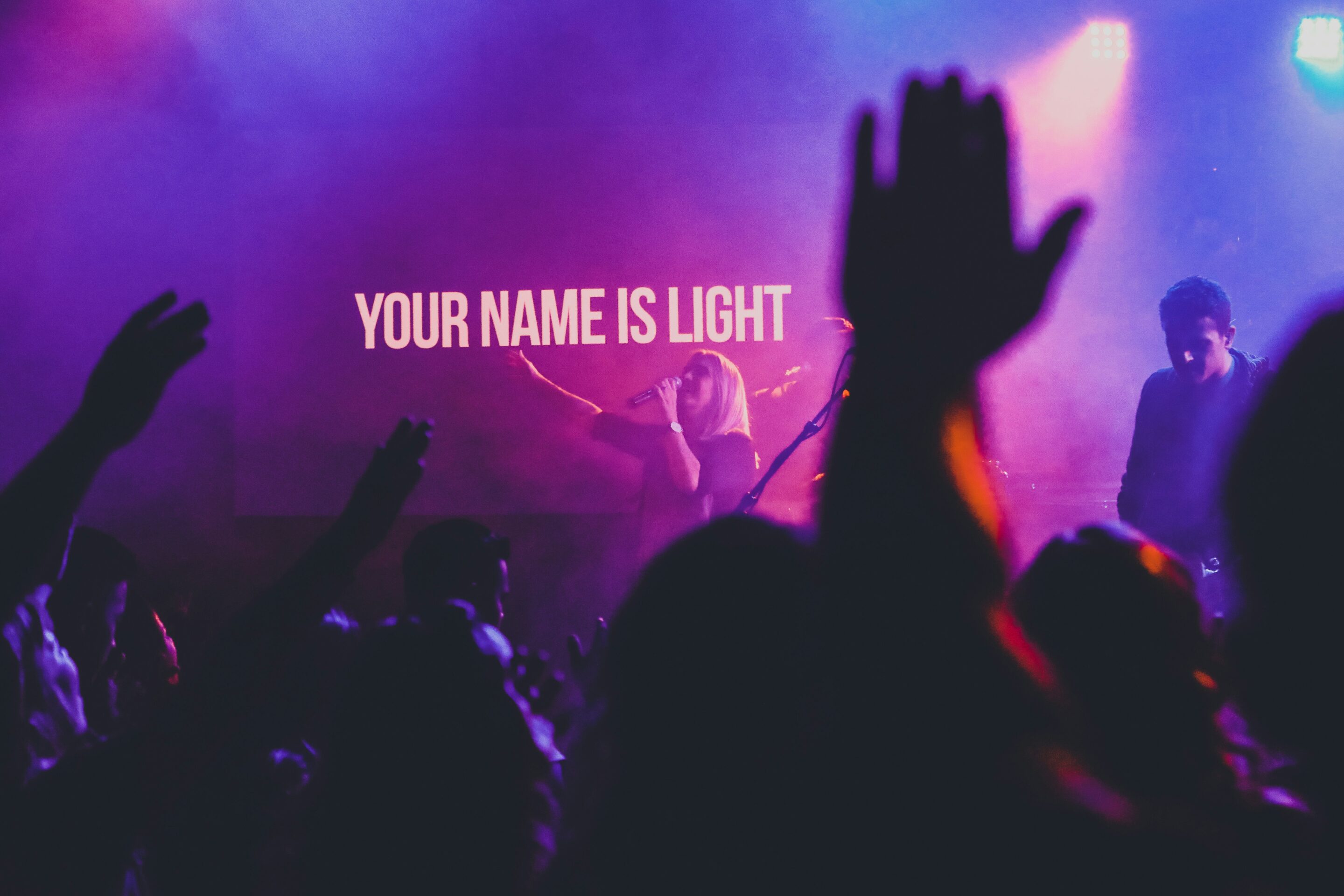
4. Imagery Shapes Perception
Images carry instant emotional weight. A cross silhouetted against a sunrise communicates hope and renewal. A city skyline might suggest mission and outreach.
Use imagery intentionally:
-
Avoid stock photos that feel generic or cliché.
-
Choose images that enhance, not compete with, the message.
-
Motion backgrounds can be powerful, but subtlety is key—movement should support focus, not distract from it.
5. Consistency Builds Trust
Psychologically, consistency signals reliability. If your slides, announcements, and sermon graphics share a common style, people subconsciously feel a sense of order and clarity.
That doesn’t mean everything must look the same week after week—but establishing a visual identity for your church’s media creates familiarity that helps people engage without confusion.
6. Simplicity Helps Retention
Research shows people remember information better when it’s presented simply. Slides packed with text overload the brain, while concise visuals reinforce key points.
-
One idea per slide keeps the message clear.
-
Use supporting visuals sparingly—less is often more.
-
Aim for slides that highlight what’s spoken, not repeat it word-for-word.

7. Worship Is the Goal, Not the Graphics
At the end of the day, visual media is a tool—not the focus. The best designs are the ones people don’t even notice because they blend so seamlessly into worship.
When your church media choices align with psychological principles of color, font, layout, and imagery, they reduce distractions and open the door for people to focus fully on worship and God’s Word.
Want to put these principles into practice? MediaShout makes it simple to create beautiful, distraction-free presentations built for worship. Try it free for 14 days here.