Obviously, when dealing with presentation design, not every church has a designer on staff. This can leave the pastor, tech volunteers, or worship team guessing when it comes to making good design decisions inside of your worship presentation software.
There’s good news, though. Worship software for churches don’t require you to be a designer to use them. In fact, presentation design can be easier than you think.
Presentation templates just need to be readable.
Readability tips for church services
Here are some tips for creating inside of your church presentation software in a way that’s easy for people to follow and read when displayed to the big screen. They’ll ensure that your congregation worships with you, and doesn’t get distracted.
1. Keep words per slide to a minimum
Many churches stuff 100+ words on a slide, and it’s very easy as a congregant to zone out or get lost. It can seem difficult to cut words down, what with lyrics, Bible passages, sermon notes and responsive readings.
But churches should aim for a maximum of 20–30 words per slide.
I know, I know: that might seem ridiculously low—it’s practically the length of a Tweet. But get this: Seth Godin, revered across many industries for his communication tactics, recommends no more than six words per slide.
Now, I think that number is a little tough to shoot for in a worship service . You’d probably end up shuffling through slides far faster than is useful. But the principle holds true: reducing the amount of words on a given slide makes the words that do show up much easier to follow.
The 20–30-word maximum isn’t a hard-and-fast rule, but if you catch a slide with more than 30 words on it, you should consider breaking it into multiple slides.
2. Make sure words are large enough for everyone
You’ll get a head start following this readability tip once you reduce the amount of words per slide. It’s much easier to bump up the size of your typeface when it’s not getting crowded out by too many words!
There’s a really simple test for checking if your text is large enough for everyone to read. Just walk to the farthest seat in your chapel or sanctuary, and see if you have to squint to read a slide.
If it’s challenging to read at that distance, picking a simple, sans-serif font (like Helvetica or Open Sans) can help. You’ll also find tip #3 to be helpful, too.

Ready to switch to the best worship software on the market? See what MediaShout church presentation software can do for you and your ministry. Download the FREE 30-day trial today!
3. Keep your text strongly contrasted against the background
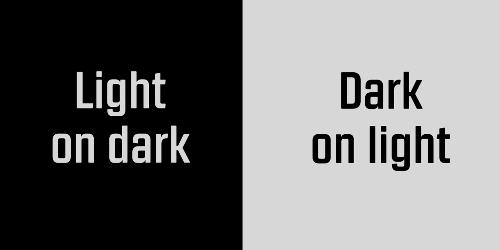
The more difference in shade you can have between your text and your background, the better your contrast. You don’t need to pick lots of bright colors. When in doubt, choose white text on a black (or very dark) background. This approach is often easier on the eyes than dark text on a light background, especially if the lights are dimmed in your sanctuary.
4. Don’t use busy backgrounds
The simpler the background, the easier it will be to make the slide readable. There’s no shame in solid colors or very mellow textured backgrounds.
If you’re not confident in your design sense, image backgrounds or animated backgrounds can be risky—there’s no guarantee that your text will show up clearly on top of it.
Look for simple background images that are either uniformly dark or uniformly light. Avoid images that are somewhere in the middle. But even more than that, avoid images that have some bright spots and some dark spots. Those provide the biggest hurdle for readers. In some places your text will look great, but in others it will disappear entirely.

Download our free popular ebook: “49 Church Presentation Tips, Tricks & Hacks”. We’ve curated advice from church staff and volunteers from all over America that use MediaShout church presentation software. Download your FREE copy today!
5. Use a contrasting outline for your text if you’re using a complex background
If there’s an image you’re dead-set on using as a background in your worship software, then here’s a trick for the text that will help it stand out when displayed. Use white text with a black outline, or black text with a white outline.
If you’ve spent much time on the Internet, you’ve seen this before. The font Impact in white with a black outline is the gold standard for memes.
You might not think much about the design choices used in memes, which actually goes to show the effectiveness of this approach. You can always read the text in them, no matter how busy the background.
If you think you might have some design-conscious congregation members, don’t rely too heavily on this method; they might not love it. Even though it works really effectively, it can seem cheesy if overused. Speaking of cheesy:
6. Watch out for too much distracting motion
Loops, video files , and animated backgrounds can be awesome—in moderation. Use these if you can do so in a way that follows the other readability tips, but do so sparingly.
Above all, resist the temptation to animate slide transitions. It’s a mistake. Slides spinning off into the distance, bullet points bouncing onto the screen, words dropping in one at a time … those will only serve to distract (and make you look like you’re trapped in the ‘90s).
BONUS TIP for MediaShout 7 users
You can get an effect like this one to use with your presentations in MediaShout. With the addition of a semi-transparent black box and drop shadow on the text, words stand out easily even on a complex background.
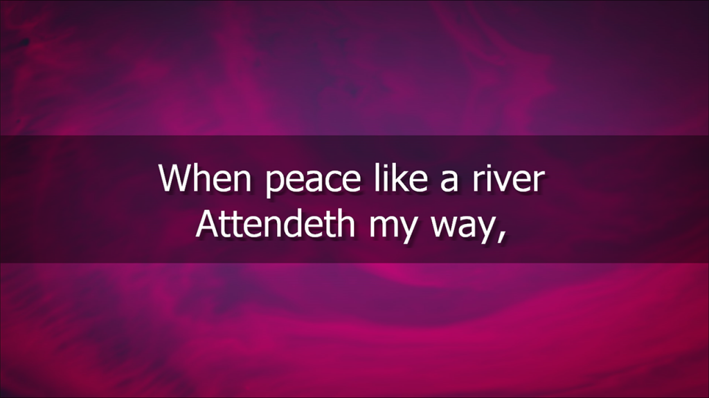
You can also create a variety of your own effects inside of your software solution like the one above to increase the readability of your presentations. Here’s how you do it:
- Select a text box in the inline editor (works with any text box).
- Look for the “FX” button next to your font selection and click on it.
- Look in the FX window to the left and select “Text Box Background”
- Adjust your opacity and background color there and hit “Apply”.
- Have fun creating great-looking text boxes!
Remember, your ultimate goal is good communication. If people can easily follow along, you’re on the right track. A good church presentation doesn’t steal the show; it supports it.
When in doubt, simpler is better.
Looking for a new and powerful church presentation software to utilize motion graphics for your church or ministry? Check out MediaShout 7 and begin using motion backgrounds for worship today!






On previous versions of MediaShout you could choose a transparent stretch to adjust the color of any background. This was a really simple way to darken your backgrounds so that text was easier to read. I know there is probably a way to do this in the new version, but it was much easier on the old version. Also, if I use a dissolve transition, only the first slide in a cue dissolves. The rest cut. What am I missing?
Paul Proft, media tech. Good Shepherd Church, Owatonna MN 507-390-1761
Paul – there are a couple of things that are different than Version 4 and earlier (which I believe you are describing). Now, you have the ability to add as many different objects as layers to your cue. This includes full-stretch colors where you can adjust opacity on them. Check out this article for notes on that as well as some sample colors that we have already created for you to download:
https://support.mediashout.com/hc/en-us/articles/223413608-Adjusting-the-Speed-of-Videos-and-Changing-the-Color-of-Media-Files
As for transitions, this is much deeper, too. Transitions on the Cue Level or only for how the cue starts from the previous cue. Within each cue are multiple objects (text boxes, images, videos, etc.). Each one of them can have it’s own set of transitions, so as you change from page to page within a cue, you can have the text change transitions differently than other objects that appear or disappear. To change that transition, simply select the object you want to work with (like the Main Text box), then click the FX button in the ribbon. In the lower left of that box is the controls for transitions in and out. Note, this is on a page by page basis, but if you want to use the same font, style, color, transition, etc. through the whole cue, then after changing the transition and all other font settings you want in the ribbon, click the Apply to Cue button to the left of that and it will change the settings for all pages in that cue to match.
Feel free to give us a call (866.857.1292) or visit our support site with any questions or for more information. Thanks and be blessed!
Just off the top of my head, couldn’t you just add a second text box, stretch it, make it the color you want, then adjust the opacity? Question tho. Why a separate object? Why not just use the main lyric box that way?
Heather,
This is also a great way to do this in Version 6 (this is not available in Version 5). Some people, though, may not want the Main Text box to be stretched all the way to the edges and it is usually faster to insert an image and set it to Full Stretch in the ribbon faster than dragging the box edges for a text box (which you would have to do in this case). Either are acceptable (which is what I love about MediaShout) and finding the fastest and best way for your team is the way to go about it. Thanks for always contributing to the discussion and offering insight! Be blessed!
That link has moved to https://support.mediashout.com/058285-Adjusting-the-Speed-of-Videos-and-Changing-the-Color-of-Media-Files .
Charles – you are correct. When we updated our service this summer, this link failed to be updated. Thanks!
I tried the method you suggested but it also tinted the text. I only want to tint the background. I’m never sure of the order of the objects in a cue. The text should always be in the foreground, because I can make the text any color I want. I also have had trouble adding the copyright info in lyric cues. It appears on the edit window and then disappears if I fire or save the cue. The same situation on bible cues. I can’t get the reference information (header and footer) to populate in a format that I like. That is, first slide, top left justified, last slide, lower left justified. Also need help making NIV 2011 default bible.
Paul – with these kinds of questions, it is better to call our team (866.857.1292) so we can walk through it with you. It’s much more difficult to talk through and explain via blog post comments. Thanks and be blessed!